Our
Brand Story

Explore our new look

Notice
something
new?

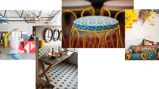
We love spicing things up at Nando’s and our new look does just that. It comes all the way from Southern Africa – the place our very first restaurant opened back in ’87.

Filled with vibrant colours, incredible patterns and interesting mixes of old and new, this new African design pays homage to our roots in a fresh, exciting way that’s packed with heat and a lot of heart!

Nipped, tucked
and looking good

Just because our cockerel, Barci, is getting older, doesn’t mean he has to age. Quite the opposite! We thought this was the perfect opportunity to give him a bit of a nip and tuck and we reckon he’s looking a whole lot younger.

We’ve taken out the leaves and refined the logo, placing him with another Nando’s favourite – a PERi-apostrophe; further strengthening the bond between chicken and PERi-PERi.

The
write stuff

When we looked at refining our quirky Nando’s font, we were once more inspired by the tradition of sign-writing in Southern Africa. So, we asked Marks Salimu – a South African sign-writer and talented artist to help us out.

Marks hand-painted all our letters and characters onto wooden panels and these were made into our new, refined font.

A new
direction

In search of a secondary font for when we have to write longer things than headlines, we looked to Johannesburg, South Africa (the vibrant city where Nando’s was born) for inspiration and found the answer in the road, adopting the same font that’s used on road signs throughout South Africa.

The font used is straightforward, legible and because it pays homage to our roots, its perfect for helping you navigate your way around Nando’s.

There’s
a pattern

Silhouettes and patterns are big in African design. So when we created our new look, we chose to have a local NGO design and create three beautiful patterns especially for us. To honour our roots, they have African, Portuguese and Nando’s touches in just the right places.

Look closely and you’ll also see the triangle, African Bird’s Eye Chillies, the Nando’s heart and even a flame or two.

Click and see Click and see

Seeing
PERi-red

We’re so passionate about PERi-PERi, we wanted to make it our official colour. So, with a bucket of African Bird’s Eye Chillies in hand, we asked Manie Pietersen – a specialist colourist with 24 years’ experience in mixing and matching colours – to help us decide the exact colour of PERi-PERi.

He nailed it and we’ve called this colour PERi-Red!

It’s not the only colour you’ll see at Nando’s. Black plays a big role, edgy neons add pops of colour and secondary colours – which we’ve drawn from our restaurants and Southern Africa – complete the mix.

Our
brand story

We’ve got two favourite stories from our history and love sharing them with our customers. That’s why you’ll see them featured in all of our restaurants… Enjoy the read!

87
Degrees

Nando’s started way back in 1987, when the first restaurant opened in Rosettenville in Johannesburg, South Africa. We’ve come a long way since then, but we’ve never forgotten our humble beginnings.

So, to remind us of our roots, all our headings are tilted at an 87 degree angle across all of our designs.

Like what
you see?

Along with a new look, we’ve also upgraded our website. Feel free to click on the sections below and explore all the new features.